We wrote many times about Green Screens high customization possibilities because of its web based nature. One of the most common customer requirements is different font visual styling.
Some languages have font styles which are sometimes hard to read with default font setup but luckily there are a vast number of browser fonts called web fonts supporting many font styles from which we can choose.
For example, one of web font libraries are Google Fonts. Use that library to test, preview and finally select font you want to use instead of provided defaults.
So, let us show you in this blog post how simple it is to reconfigure web terminal with custom font styling.
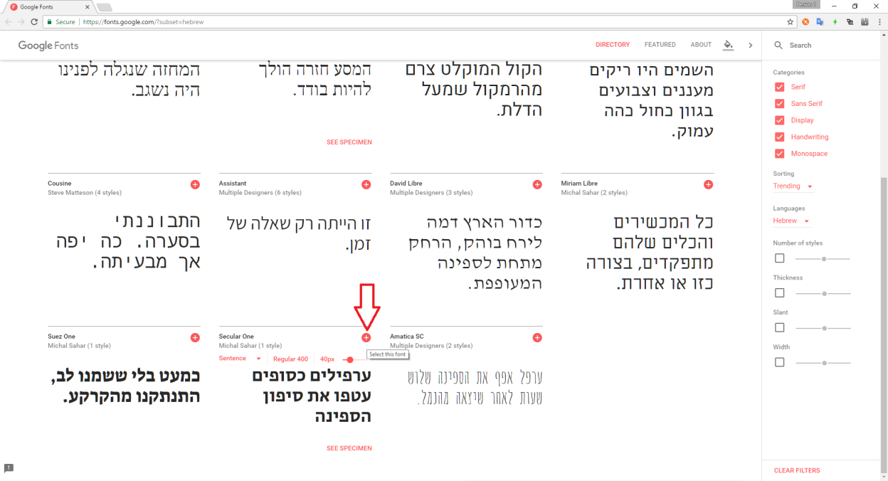
First, open Google Fonts web site and for example select Secular One font by clicking 'plus' icon as shown on image below.
Second, click selected box to show popup with font embedding instructions. We will need two values as shown on next image.
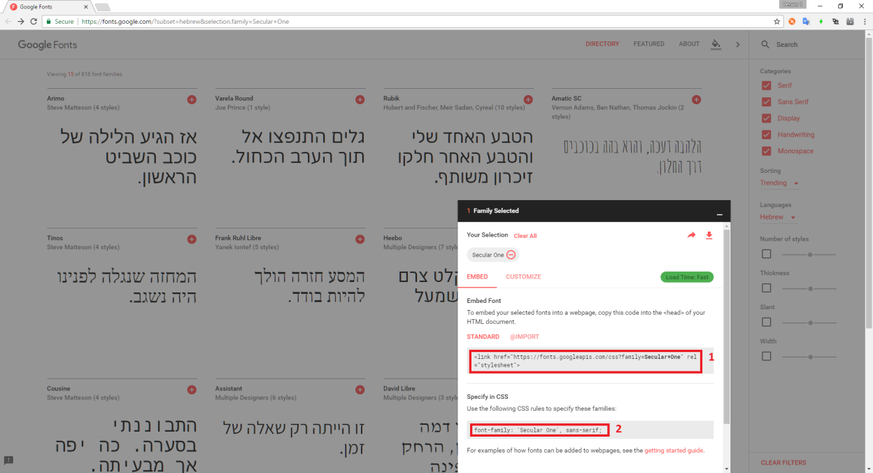
Use marked values to prepare styling. As an option, one can download font resources and deploy them locally to the server. This is useful if there are lot of intranet workstations or when Internet connection is blocked.
<link href="https://fonts.googleapis.com/css?family=Secular+One" rel="stylesheet">
<style>
.tngrid {
    font-family: "Secular One",san-serif !important;
}
</style>
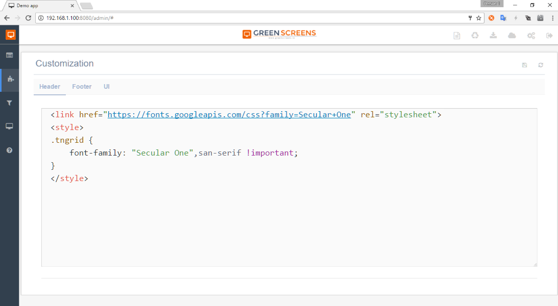
Add sample script shown above to UI customization header through Green Screens Web Admin interface.
And finally, open web terminal session to review changes. Following pictures show original and new font styling based on Secular One font.
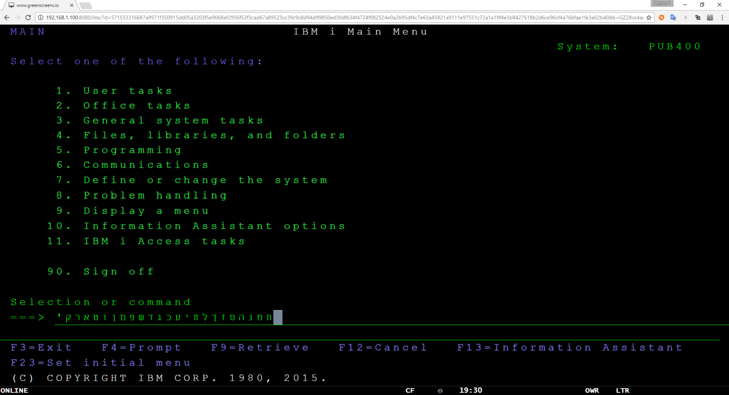
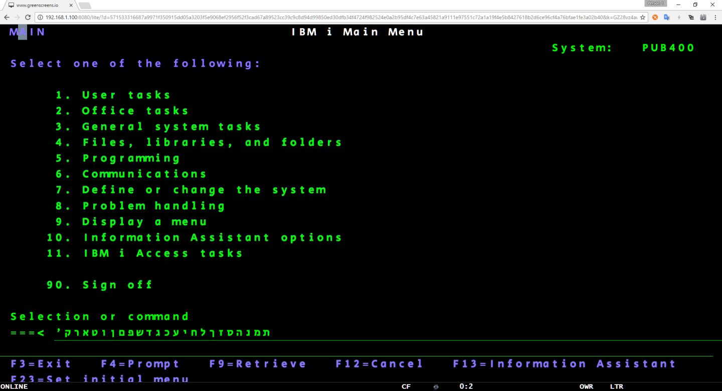
As you can see, last row is not visible with new font. Reason for that is font width to height ratio (font aspect ratio) which is different for different fonts. Web terminal calculates font sizes with ratio specific to default fonts used which is most common ratio. Even with slightly different ratios, calculated font size should be fine. Still, there are cases like this one which does not render properly and we need to tweak it.
To do this, simple solution is CSS @media queries which will override calculated values by setting different font sizes depending on browser width and height. Here is a simple example with large list of media queries. You can use it and tweak it to your requirements. When you are satisfied with solution, you can add it to the Green Screens Web Admin interface under .tngrid.
TIP: Larger screens (27x32) will have additional CSS class .wide. Use that class to fine tune font sizing.
From latest version it is possible to modify screen border gap for better font fitting if needed.
.tnview {
    padding-top: 4%;
    padding-bottom: 4%;
    padding-left: 10%;
    padding-right: 10%;
}
    /* Custom, iPhone Retina */
    @media only screen and (min-width : 320px) {
         .tngrid {
            font-size : 0.3em !important;
        }
    }

    /* Extra Small Devices, Phones */
    @media only screen and (min-width : 480px) {
        .tngrid {
            font-size : 0.7em !important;
        }
    }

    /* Small Devices, Tablets */
    @media only screen and (min-width : 768px) {
        .tngrid {
            font-size : 1em !important;
        }
    }

    /* Medium Devices, Desktops */
    @media only screen and (min-width : 992px) {
        .tngrid {
            font-size : 1.1em !important;
        }
    }

    /* Large Devices, Wide Screens */
    @media only screen and (min-width : 1200px) {
        .tngrid {
            font-size : 1.1em !important;
        }
    }


    /*==========  Non-Mobile First Method  ==========*/

    /* Large Devices, Wide Screens */
    @media only screen and (max-width : 1200px) {
        .tngrid {
            font-size : 1em !important;
        }
    }

    /* Medium Devices, Desktops */
    @media only screen and (max-width : 992px) {
        .tngrid {
            font-size : 1em !important;
        }
    }

    /* Small Devices, Tablets */
    @media only screen and (max-width : 768px) {
        .tngrid {
            font-size : 1em !important;
        }
    }

    /* Extra Small Devices, Phones */
    @media only screen and (max-width : 480px) {
        .tngrid {
            font-size : 1em !important;
        }
    }

    /* Custom, iPhone Retina */
    @media only screen and (max-width : 320px) {
        .tngrid {
            font-size : 1em !important;
        }
    }


/* Smartphones (portrait and landscape) ----------- */
@media only screen and (min-device-width: 320px) and (max-device-width: 480px) {
  /* Styles */
}

/* Smartphones (landscape) ----------- */
@media only screen and (min-width: 321px) {
  /* Styles */
}

/* Smartphones (portrait) ----------- */
@media only screen and (max-width: 320px) {
  /* Styles */
}

/* iPads (portrait and landscape) ----------- */
@media only screen and (min-device-width: 768px) and (max-device-width: 1024px) {
  /* Styles */
}

/* iPads (landscape) ----------- */
@media only screen and (min-device-width: 768px) and (max-device-width: 1024px) and (orientation: landscape) {
  /* Styles */
}

/* iPads (portrait) ----------- */
@media only screen and (min-device-width: 768px) and (max-device-width: 1024px) and (orientation: portrait) {
  /* Styles */
}

/* iPad 3 (landscape) ----------- */
@media only screen and (min-device-width: 768px) and (max-device-width: 1024px) and (orientation: landscape) and (-webkit-min-device-pixel-ratio: 2) {
  /* Styles */
}

/* iPad 3 (portrait) ----------- */
@media only screen and (min-device-width: 768px) and (max-device-width: 1024px) and (orientation: portrait) and (-webkit-min-device-pixel-ratio: 2) {
  /* Styles */
}

/* Desktops and laptops ----------- */
@media only screen and (min-width: 1224px) {
  /* Styles */
  .tngrid {
            font-size : 1.4em !important;
  }
}

/* Large screens ----------- */
@media only screen and (min-width: 1824px) {
  /* Styles */
}

/* iPhone 4 (landscape) ----------- */
@media only screen and (min-device-width: 320px) and (max-device-width: 480px) and (orientation: landscape) and (-webkit-min-device-pixel-ratio: 2) {
  /* Styles */
}

/* iPhone 4 (portrait) ----------- */
@media only screen and (min-device-width: 320px) and (max-device-width: 480px) and (orientation: portrait) and (-webkit-min-device-pixel-ratio: 2) {
  /* Styles */
}

/* iPhone 5 (landscape) ----------- */
@media only screen and (min-device-width: 320px) and (max-device-height: 568px) and (orientation: landscape) and (-webkit-device-pixel-ratio: 2) {
  /* Styles */
}

/* iPhone 5 (portrait) ----------- */
@media only screen and (min-device-width: 320px) and (max-device-height: 568px) and (orientation: portrait) and (-webkit-device-pixel-ratio: 2) {
  /* Styles */
}

/* iPhone 6 (landscape) ----------- */
@media only screen and (min-device-width: 375px) and (max-device-height: 667px) and (orientation: landscape) and (-webkit-device-pixel-ratio: 2) {
  /* Styles */
}

/* iPhone 6 (portrait) ----------- */
@media only screen and (min-device-width: 375px) and (max-device-height: 667px) and (orientation: portrait) and (-webkit-device-pixel-ratio: 2) {
  /* Styles */
}

/* iPhone 6+ (landscape) ----------- */
@media only screen and (min-device-width: 414px) and (max-device-height: 736px) and (orientation: landscape) and (-webkit-device-pixel-ratio: 2) {
  /* Styles */
}

/* iPhone 6+ (portrait) ----------- */
@media only screen and (min-device-width: 414px) and (max-device-height: 736px) and (orientation: portrait) and (-webkit-device-pixel-ratio: 2) {
  /* Styles */
}

/* Samsung Galaxy S3 (landscape) ----------- */
@media only screen and (min-device-width: 320px) and (max-device-height: 640px) and (orientation: landscape) and (-webkit-device-pixel-ratio: 2) {
  /* Styles */
}

/* Samsung Galaxy S3 (portrait) ----------- */
@media only screen and (min-device-width: 320px) and (max-device-height: 640px) and (orientation: portrait) and (-webkit-device-pixel-ratio: 2) {
  /* Styles */
}

/* Samsung Galaxy S4 (landscape) ----------- */
@media only screen and (min-device-width: 320px) and (max-device-height: 640px) and (orientation: landscape) and (-webkit-device-pixel-ratio: 3) {
  /* Styles */
}

/* Samsung Galaxy S4 (portrait) ----------- */
@media only screen and (min-device-width: 320px) and (max-device-height: 640px) and (orientation: portrait) and (-webkit-device-pixel-ratio: 3) {
  /* Styles */
}

/* Samsung Galaxy S5 (landscape) ----------- */
@media only screen and (min-device-width: 360px) and (max-device-height: 640px) and (orientation: landscape) and (-webkit-device-pixel-ratio: 3) {
  /* Styles */
}

/* Samsung Galaxy S5 (portrait) ----------- */
@media only screen and (min-device-width: 360px) and (max-device-height: 640px) and (orientation: portrait) and (-webkit-device-pixel-ratio: 3) {
  /* Styles */
}